
The word that gets used like a magic spell
"High-converting" is one of those phrases that ends up meaning nothing because it gets used to mean everything. Strip the jargon and it is simple. A high-converting website does one thing well: it makes the next step obvious, easy, and worth taking. That is the entire job. We have spent the last year auditing small business sites across New Jersey, and the gap between the good ones and the rest comes down to five clear signals. None of them are exotic. All of them are fixable. Most owners can spot which ones their site is missing in fifteen minutes.
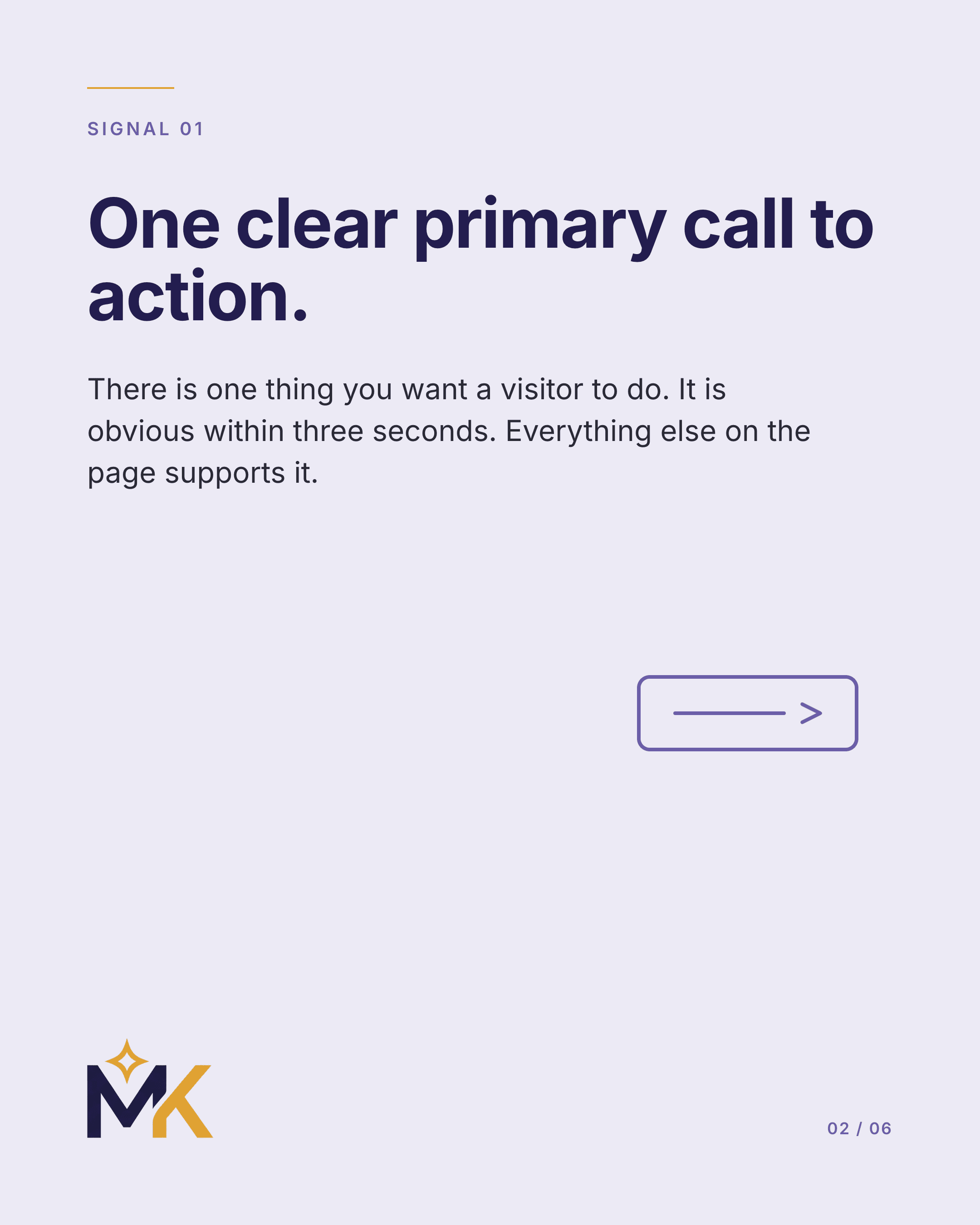
Signal 1 — One clear primary call to action
There is exactly one thing you want a visitor to do. Book a consult. Order takeout. Request a quote. Call your line. It should be obvious within three seconds of landing on your homepage, and every other element on the page should support it rather than compete with it. Most small business sites have five "primary" CTAs scattered across the hero, each in a different color, all fighting for the same click. The result is decision paralysis. Pick one. Lead with it. Repeat it at the top, the middle, and the bottom of the page. A confused visitor never converts.
Signal 2 — Page speed under two seconds
More than half of mobile visitors abandon a site that takes longer than three seconds to load. Speed is not a luxury, it is the floor. The biggest culprits are uncompressed images, blocking JavaScript from heavy page builders, and bloated themes from drag-and-drop platforms. A well-built site loads in under two seconds on a slow 4G connection. Test yours at pagespeed.web.dev. If you are seeing scores under 70 on mobile, you are losing customers before they ever see your offer. Most fixes are not redesigns. They are compression, caching, and dropping plugins you are not actually using.
Signal 3 — Social proof, placed where decisions happen
Testimonials, reviews, and case studies are persuasion, not decoration. They should not live on a separate "Reviews" page that nobody visits. They should sit next to the booking button, next to the price, next to the contact form. The moment a visitor is deciding whether to act is the moment you want a real customer's voice in their ear. Three short, specific quotes beat ten generic ones every time. "Saved me four hours a week" lands. "Great service!" does not.
Signal 4 — Mobile-first, not mobile-tolerated
The majority of small business traffic comes from phones. If your site was designed on a desktop and shrunk down, you can feel it. The buttons are too small. The spacing is awkward. The photos crop strangely. The menu hides behind a tap that loads slowly. Mobile-first means the layout is designed for the phone screen first, then expanded to fit desktop, not the other way around. Open your own site on your phone right now. If you wince, your customers do too. They just close the tab instead of telling you.
Signal 5 — Plain-English copy that respects the reader
The fastest way to lose a small business website visitor is to lead with jargon. "Synergistic solutions" and "industry-leading expertise" mean nothing to someone trying to decide if they should book a haircut, order a cake, or hire a plumber. Write the way you would talk to a customer across the counter. Short sentences. Specific words. One idea per paragraph. The site does not need to sound impressive. It needs to be clear. Clarity converts. Polish without clarity is just expensive decoration.
Audit your own site in fifteen minutes
Open your homepage on your phone. Time how long it takes to load. Read the first sentence. Does it tell a stranger what you do and who you do it for? Find the primary CTA. Is it obvious? Scroll to the bottom. Did you see real customer voices anywhere along the way? Try to book or contact you. Was it three taps or seven? Most owners who run this audit honestly find two or three signals are weak. Fix those first. You do not need a full redesign to recover most of the lost conversions.
When to redesign versus when to improve
If the bones are good — clear story, fast enough load, mobile-decent — fix what is broken. Move testimonials closer to CTAs. Replace one paragraph at a time. If the site is more than four years old, was built on a heavy template, or you cannot change anything without paying someone every time, a clean rebuild usually costs less than a year of patches. A real custom site, built right, starts around $999 and lasts five years before it needs more than copy edits. Anything cheaper is rented. Anything heavier than that is selling you complexity.